


りゅーそう
元高校地歴科教員。現在microCMSでエンジニアをしています。
Saitama.jsというLT会を運営中です。
発言はすべて個人の意見です。
jamstack
nextjs
microcms
2020/12/02
2022/01/23
この記事はJamstack Advent Calender 5日目の記事です。
はじめまして。りゅーそう(@ryusou_mtkh)です。
現在、埼玉県の高校で地歴科の教員をしています。教員の業務軽減や生徒の学びの場や手段を増やすためにプログラミングを勉強しています。
先日、WEBサイトで歴史について学べるHisTubeというメディアサイト的なものを公開しました。
このサイトは以下のような技術を使って制作しています。
今回はそのサイトを作って得た知見を共有できたらと思います。
まずはじめになぜこのようなサイトを作ったのかお話させてください。
Jamstackの話とはあまり関係がないので、興味のない方は次の章どうやってHisTubeを作ったか?まで飛ばして読んでください。
HisTubeとはYouTubeとテキストで歴史について学べるサイトです。YouTube動画も理想を言えば自分で作れれば良いのですが、現在は時間のリソースがないので勉強になるYouTube動画を導入として紹介→その時代の概要がわかるようにテキストで解説と行った構成になっています。
歴史を学ぶ高校生です。特になかなか歴史に興味がもてない生徒を対象にしています。興味をもてるようなコンテンツを紹介しつつ、歴史の概要を無理のない範囲で頭に入れられるようなコンテンツを目指しています。
定期テストや歴史の理解度を大まかにチェックできたら良いなと思っているので、歴史の理解度チェックの項目を各ページに設けています。
イメージとしては一切歴史に興味をもてない→なんか歴史を勉強してみようかな?と思ってもらえることを目標にしています。
現在コロナ禍で、学習が制限されてしまっている現状が続いています。そんな中叫ばれているのがオンライン授業です。
オンライン授業ではZoomなどの対話式やYouTubeなどに動画教材をアップするなど、教育現場でも試行錯誤しながら行われています。
そこでいつも問題になるのが子供たちの通信環境の問題です。通信環境に恵まれない子供たちはどうしても通信量などの問題から動画などの再生に制限がかかってしまいます(さらにはそれを理由にオンライン教育は難しいだろうと全体の教育もストップしてしまう風潮も多くみられます)。
そこでわたしはせめてテキスト教材でも届けられたらと思い、このように動画とテキストを併用する形のサイトを運営しようと決めました。
教員というものは非常に真面目な人達で、彼らは「教材はオリジナルのものを作らなければならない!!他の教材を真似するなんて」と思いがちです。
もちろんそういった方々の努力のおかげでより良い教育が生まれているわけなのでありますが、それをもっとオープンに公開していけば相乗効果でもっと良い教育が生まれるはずですし、教材研究の負担も軽減できるはずです。
YouTubeや各Edtechの教材など、現在では優れたコンテンツも数多くある中、それを活用しないのはとてももったいないと思っています。
自分のコンテンツを公開していく流れができればと思い公開してみました。今後は自身が授業で使用しているスライドなども共有できる仕組みを作れればと思っています。
HisTubeはNext.js×microCMS×VerselといういわゆるJamstack構成で作成されています。なぜこのような技術構成にしたかというと、自分の好きな技術ということもありますが、ネット環境があまり良くない生徒のためにもなるべくパフォーマンスを重視できるサイトを制作したいという思いがあったからです。
JamstackではいわゆるSSG(静的サイトジェネレーター)という仕組みを採用しているNext.js,Gatsby.jsやNuxt.jsのようなフレームワークを採用することによって、自分のようにあまりWebパフォーマンスの知見がない人でもある程度のパフォーマンスを出すことができます。
以下は実際の数値になります。
もちろん改善の余地は多々ありますが、Performanceの数値が90を超えています(アクセシビリティやPWA対応などやることはまだまだ多そうですね...)。
どんなネット環境の人でもサイトをある程度快適に使用できるということはWEBアクセシビリティの一つだと思っているので、その点でJamstackはとても良い選択肢でした。
ここから本題です。
冒頭でも述べたとおり、HisTubeは以下のような技術を使用して制作しました。
SSG
Next.js(TypeScript)
HeadlessCMS
microCMS
CSS
styled-components
その他
storybook
unified
ここではこれらの技術をどのようにして使用してWEBサイトを作成したかポイントを解説します。
シンプルなmicroCMS×Next.js×Verselの使用方法は以下のmicroCMS公式チュートリアルが詳しいのでそちらを参照すると良いと思います。
microCMS + Next.jsでJamstackブログを作ってみよう
HisTubeはGitHubでコードを公開しているのでご参照ください(issue等々コントリビュートも歓迎しています)。
HisTube | Youhei Nozaki
microCMSとは日本語のUIで作成されたHeadlessCMSです。基本的なAPIの作成手順はmicroCMSのブログなどを参考にするとよいと思います。
microCMSのはじめ方
今回は実際に表示されるコンテンツの部分にカスタムフィールドを使用しました。先日の料金プランの変更で無制限で使用できるようになりました。
カスタムフィールドと繰り返しフィールドを使用すると内容を追加していくようなUIでコンテンツを作成していくことができます。
繰り返しフィールドが追加されました
今回は以下のようなカスタムフィールドを作成しました。
h1タグに相当するようなHeading1やYouTube動画の埋め込みはリッチエディタの標準機能にありますが、このように指定してカスタムフィールドに切り出して置くことで実装がしやすくなったり、コンテンツを作成する側もリッチエディタの使用方法がシンプルになると思います。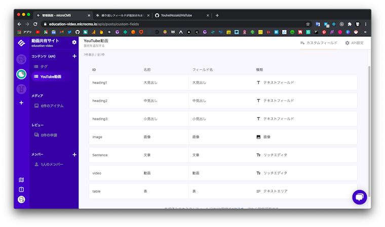
ちなみにカスタムフィールドの Sentence の詳細設定には「 B の強調表現とリスト、リンクしか使わないでください」という説明を加えるなど、シンプルに使ってもらえるような設計と説明にしています。
このようにすることでクライアント側からもコンテンツの一貫性が保たれるような仕組みを作っています。
このカスタムフィールドは以下のようにAPIに設定することで使用することができます。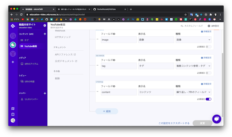
詳しくはmicroCMSのブログをご覧ください。
次はフロントエンドの開発部分にうつっていきます。
Next.jsのstyled-componentsの設定は公式のexampleを参考にしました。
Next.js | with-styled-components
_docement.tsxに以下のようなSSRの設定を行います。
/* eslint-disable */
import Document, {
  Html,
  Head,
  Main,
  NextScript,
  DocumentContext,
} from 'next/document';
import { ServerStyleSheet } from 'styled-components';

class MyDocument extends Document {
  static async getInitialProps(ctx: DocumentContext) {
    const sheet = new ServerStyleSheet();
    const originalRenderPage = ctx.renderPage;

    try {
      ctx.renderPage = () =>
        originalRenderPage({
          enhanceApp: (App) => (props) =>
            sheet.collectStyles(<App {...props} />),
        });
      const initialProps = await Document.getInitialProps(
        ctx,
      );
      return {
        ...initialProps,
        styles: (
          <>
            {initialProps.styles}
            {sheet.getStyleElement()}
          </>
        ),
      };
    } finally {
      sheet.seal();
    }
  }

  render(): JSX.Element {
    return (
      <Html>
        <Head />
        <body>
          <Main />
          <NextScript />
        </body>
      </Html>
    );
  }
}

export default MyDocument;
また、styled-componentsのThemeProviderの機能を使って値をthemeの値を共通化し、styled-componentsを定義したコンポーネント以外からアクセスできないようにします。GlobalStyleとThemeProviderはNext.jsでは_app.tsxに定義します。
import { AppProps } from 'next/app';
import { ThemeProvider } from 'styled-components';
import { theme } from 'theme';
import { GlobalStyle } from 'theme/global';
import { Normalize } from 'styled-normalize';

function MyApp({
  Component,
  pageProps,
}: AppProps): React.ReactNode {
  return (
    <>
      <Normalize />
      <GlobalStyle />
      <ThemeProvider theme={theme}>
        {/* eslint-disable-next-line react/jsx-props-no-spreading */}
        <Component {...pageProps} />
      </ThemeProvider>
    </>
  );
}

export default MyApp;
themeの値はReactのUIライブラリであるChakra-UIを参考にしたりしました。tailwaind-cssに影響を受けているライブラリでマテリアルデザインに準拠してあるような値が設定されていています。
ChakraUI | GitHub
またNext.jsでstyled-componentsを使用する上ではいろいろ議論もあるようですが、慣れているCSS in JSを使いたいのでstyled-componentsを採用しました。ただ、なるべくツールに依存しないような書き方を心がけてみました。具体的には以下の記事を参考にしました。
経年劣化に耐える ReactComponent の書き方
これに加えてAt(om)ic design的な考えを一部取り入れています。現状atoms とtemplatesしかありませんが、複雑なコンポーネントが出てきたら拡張するかもしれません。
例えばatoms/Button.tsxは以下のようになります。
import styled from 'styled-components';

type Props = {
  className?: string;
  text: string;
};

const Component: React.FC<Props> = ({
  className,
  text,
}): JSX.Element => {
  return (
    <button className={className} type="button">
      {text}
    </button>
  );
};

const StyledComponent = styled(Component)`
  padding: 8px 20px;
  color: ${(props) => props.theme.colors.white};
  background: ${(props) => props.theme.colors.purple[400]};
  text-decoration: none;
  border-radius: 4px;
  border-bottom: solid 4px
    ${(props) => props.theme.colors.purple[500]};
  :hover {
    cursor: pointer;
  }
  :active {
    transform: translateY(4px);
    box-shadow: 0px 0px 1px rgba(0, 0, 0, 0.2);
    border-bottom: none;
  }
`;

export const Button = StyledComponent;
microCMSで作成したAPIを使用して開発を進めていきます。
HisTubeではStorybookを使用してコンポーネント駆動開発をしてみました。これが思いの外良かったので共有します。
カスタムフィールドを用いて表示するとどのようにブラウザで表示されるのか?実装する前にstorybook上で簡単に再現することができます。
まずはstorybookをNext.jsに導入します。ここでは基本的なaddonを追加しています。
yarn add @storybook/react @storybook/addon-links @storybook/addon-essentials @storybook/addon-actions.storybookディレクトリを作成し、以下のようなファイルを作成します。
// .storybook/main.js
const path = require('path');

module.exports = {
  stories: ['../src/**/*.stories.@(ts|tsx|js|jsx|mdx)'],
  addons: [
    '@storybook/addon-actions',
    '@storybook/addon-links',
    '@storybook/addon-essentials',
  ],
  // webpackの設定、以下のように設定することでNext.jsのbaseURLに対応できます。
  webpackFinal: async (config) => {
    config.resolve.modules = [
      path.resolve(__dirname, '../src'),
      'node_modules',
    ];

    return config;
  },
};
//.storybook/preview.js
import React from 'react';
import { ThemeProvider } from 'styled-components';
import { theme } from '../src/theme';
import { GlobalStyle } from '../src/theme/global';
import { Normalize } from 'styled-normalize';
export const parameters = {
actions: { argTypesRegex: '^on[A-Z].*' },
};
//decoratorでstyled-componentsのGlobalStyles等を読み込みます。
export const decorators = [
(Story) => {
return (
<ThemeProvider theme={theme}>
<Normalize />
<GlobalStyle />
<Story />
</ThemeProvider>
);
},
];
pakage.jsonに以下のスクリプトを記述しておきます
Next.jsでは./publicディレクトリに静的ファイルを置くのでその設定も加えています。
    "storybook": "start-storybook -p 6006 -s ./public",
    "build-storybook": "build-storybook"
以上で設定完了です。
ただnext/imageを使用すると上手く動きませんでした。next/imageはlocal環境では別ドメインやimgixなどのホスティングサービスで最適化された画像を使用するため、storybook上では現状上手く動作しないようです。良い方法あれば教えていただけると嬉しいです。
https://github.com/vercel/next.js/issues/18393
ではカスタムフィールドを表示したものをコンポーネントで再現してみましょう。
まずは繰り返し使うHeadingなどをcomponents/atomsに書いていきます。
// components/atoms/Heading/index.tsx
import styled from 'styled-components';

type Props = {
  className?: string;
  text: string;
};

const Component: React.FC<Props> = ({
  className,
  text,
}): JSX.Element => {
  return <h1 className={className}>{text}</h1>;
};

const StyledComponent = styled(Component)`
  font-size: 28px;
  color: ${(props) => props.theme.colors.purple[800]};
  padding: 4px;
  border-bottom: solid 1px
    ${(props) => props.theme.colors.gray[200]};
`;

export const Heading = StyledComponent;
このコンポーネントのStoryは以下のようになります。
ディレクトリ構造が分かりやすいように同じディレクトリにStoryを記述していきます。
// components/atoms/Heading/Heading.stories.tsx
import { Meta } from '@storybook/react/types-6-0';
import { Heading } from '.';

export default {
  title: 'components/atoms/Heading',
  component: Heading,
} as Meta;

export const Primary: React.FC = () => (
  <Heading text="動画一覧ページ" />
);
実際にstorybookを起動してみましょう
yarn storybook
以下のようにコンポーネントが出力されます。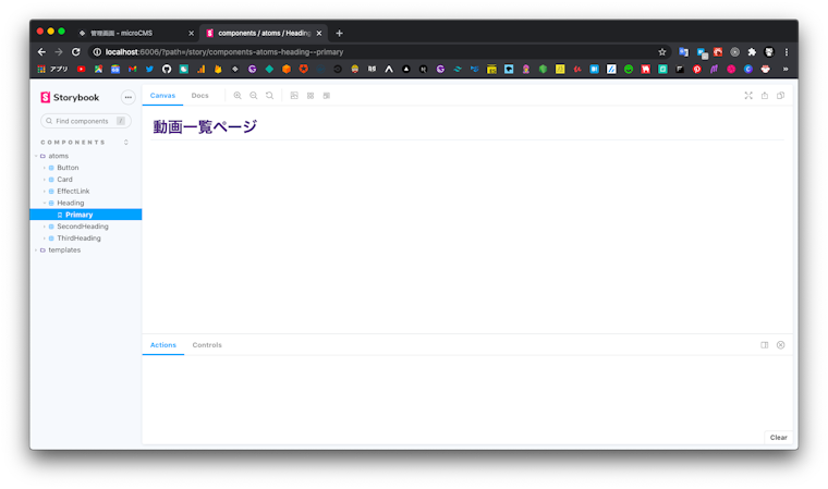
このようなコンポーネントを使用してカスタムフィールドのUIが表示されるように実装していきます。
実装方法は公式のブログを参考にしました。
//components/templates/Sentence/index.tsx
//pageに直接呼ばれるまとまったコンポーネントなのでtemplatesに記述しています。

/* eslint-disable no-nested-ternary */
import styled from 'styled-components';
import type { ContentType } from 'types/post';

import { Heading } from 'components/atoms/Heading';
import { SecondHeading } from 'components/atoms/SecondHeading';
import { ThirdHeading } from 'components/atoms/ThirdHeading';
import { renderAst } from 'lib/renderHtml';

type Props = {
  className?: string;
  content?: ContentType[];
};

const Component: React.FC<Props> = ({
  className,
  content,
}): JSX.Element => {
  return (
    <main className={className}>
      {content.map((c) =>
        c.fieldId === 'heading1' ? (
          <Heading key={c.fieldId} text={c.heading1} />
        ) : c.fieldId === 'heading2' ? (
          <SecondHeading
            key={c.fieldId}
            text={c.heading2}
          />
        ) : c.fieldId === 'heading3' ? (
          <ThirdHeading key={c.fieldId} text={c.heading3} />
        ) : c.fieldId === 'Sentence' ? (
          <div>{renderAst(c.sentence)}</div>
        ) : c.fieldId === 'video' ? (
          <div className="iframe-wrap">
            <div>{renderAst(c.video)}</div>
          </div>
        ) : null,
      )}
    </main>
  );
};

const StyledComponent = styled(Component)`
  & .iframe-wrap {
    position: relative;
  }
  & .iframe-wrap::before {
    content: '';
    display: inline-block;
    padding-top: 56.25%;
  }
  iframe {
    position: absolute;
    top: 0;
    left: 0;
    width: 100%;
    height: 100%;
    padding: 4px;
    @media (min-width: 560px) {
      padding: 24px;
    }
  }
`;

export const Sentence: React.FC<Props> = (props) => {
  const { children, content } = props;

  return (
    <StyledComponent content={content}>
      {children}
    </StyledComponent>
  );
};
c.fieldId === 'heading1' というようにカスタムフィールドのfieldIdによって使用するコンポーネントを当てることによって、繰り返しフィールドで追加した順番のとおりのUIが表示されます。
renderAstはmicroCMSから出力されたデータをHTMLにパースする関数です。unified関連のパッケージを使用しています。実装は以下のようになります。
// lib/renderhtml/index.tsx

import React from 'react';
import unified from 'unified';
import parse from 'rehype-parse';
import rehypeReact from 'rehype-react';

import { Paragraph } from './paragraph';
import { Strong } from './strong';

export function renderAst(
  content: string,
): React.ReactNode {
  const htmlAst = unified()
    .use(parse, { fragment: true })
    .use(parse)
    .use(rehypeReact, {
      createElement: React.createElement,
      Fragment: React.Fragment,
      components: {
        p: Paragraph,
        strong: Strong,
      },
    })
    .processSync(content).result;

  return htmlAst;
}
これをstorybookで表示されるかチェックしてみましょう。
microCMSの管理画面からモックのデータをmicroCMSのAPI設定>APIリファレンス>試してみるで出力します。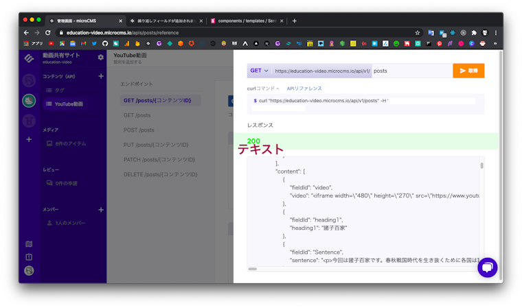
このデータのcontent以下をコピペしてStoryに貼り付けます。
//components/templates/Sentence_Sentence.stories.tsx
/* eslint-disable @typescript-eslint/no-unsafe-member-access */
/* eslint-disable @typescript-eslint/no-unsafe-assignment */
import { Meta, Story } from '@storybook/react/types-6-0';
import { PostType } from 'types/post';
import { Sentence } from '.';

export default {
  title: 'components/templates/Sentence',
  component: Sentence,
} as Meta;

const Template: Story<PostType> = (args) => (
  <Sentence {...args} />
);

export const Default = Template.bind({});
Default.args = {
  content: [
    {
      fieldId: 'heading1',
      heading1:
        '中国史の順番を「アルプス一万尺」で覚えよう',
    },
    {
      fieldId: 'video',
      video:
        '<iframe width="480" height="270" src="https://www.youtube.com/embed/MQKZ3azlmUM?feature=oembed"    frameborder="0" allow="accelerometer; autoplay; clipboard-write; encrypted-media; gyroscope; picture-in-picture" allowfullscreen></iframe><p><br></p>',
    },
    {
      fieldId: 'Sentence',
      sentence:
        '<p>中国王朝第1回目は「<strong>中国王朝を覚える</strong>」です。<br>中国王朝の順番を覚えておくと、中国史の歴史の流れが頭に入ってきて学びやすくなると思うのでぜひ覚えましょう。<br>「アルプス一万尺」の替え歌を何回か繰り返し歌えば覚えられると思います。</p>',
    },
   // 省略
  ],
};
このようなstoryを作成すると、以下のようにstorybookで繰り返しフィールドが再現できました。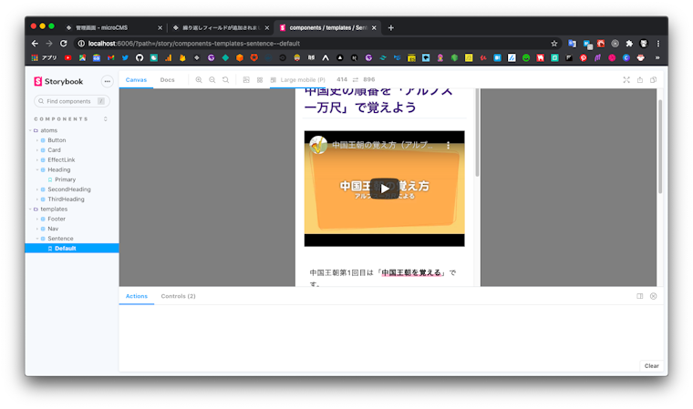
まだビジュアルテストなどを導入していないため、storybookを導入した恩恵を完全に受け切れているわけではないですが、このようにコンポーネントを先に作成することによって開発がとてもスムーズにいきました(慣れるまで設定に戸惑いましたが)。
これらのコンポーネントを使ってページ部分の実装を進めていきます。
microCMSのデータをTypeScriptで扱うために型を定義しておきましょう。
export type PostTag = {
  id: string;
  name: string;
};

//先ほどのSentenceコンポーネントを作成したときに使用した型
export type ContentType = {
  fieldId: string;
  heading1?: string;
  heading2?: string;
  heading3?: string;
  video?: string;
  sentence?: string;
  image?: {
    url?: string;
  };
};

//pageを作成するときには以下の型を使用する
export type PostType = {
  id: string;
  createdAt: string;
  updatedAt: string;
  title: string;
  image?: {
    url: string;
  };
  tag: PostTag[];
  content?: ContentType[];
};

export type PostsType = {
  contents: PostType[];
};
今回はデータフェッチをするために標準に組み込まれているfetchを利用していきます。
ただ、TypeScriptでfetchを使うときには難点があって、それはデータを返す際にはresponse.json()をしてJSONを返す処理を行うので型を参照できなくなってしまうということです。
fetchでも型を参照できるようにオレオレfetchラッパーを作成します。
/* eslint-disable @typescript-eslint/no-unsafe-return */
/* eslint-disable @typescript-eslint/no-unsafe-assignment */

export async function http<T>(
  request: RequestInfo,
  headers?: RequestInit,
): Promise<T> {
  const response = await fetch(request, headers);

  return response.json();
}

// microCMSのAPI-KEYを含んだリクエストも定義しておく
export const request = new Request(
  'https://education-video.microcms.io/api/v1/posts',
  {
    headers: {
      'X-API-KEY': `${process.env.X_API_KEY}`,
    },
  },
);
eslintのコメントがあることからもわかるように、結局返している値はresponse.jsonなのでanyであることには変わりはないですが、これで定義した型を参照して補完を受けながら快適にコーティングをする準備が整いました(厳密にやるにはもう少し良い方法があるかもしれませんね)。
posts/[id].tsxを作成していきます。記事詳細ページに当たります。https://url..../posts/idにあたるページを作成します。
このような動的なページを作成するにはgetStaticPropsとgetStaticPathを使用します。
//pages/posts/[id].tsx
import {
  GetStaticPaths,
  GetStaticProps,
  GetStaticPropsContext,
} from 'next';
import { useRouter } from 'next/dist/client/router';
import styled from 'styled-components';

import { http, request } from 'lib/fetch';
import { Layout } from 'components/templates/layout';
import { Sentence } from 'components/templates/Sentence';
import { HeadTemplate } from 'components/templates/Head';
import type { PostsType, PostType } from 'types/post';
import { Heading } from 'components/atoms';

type Props = {
  post: PostType;
  className?: string;
};

export const getStaticPaths: GetStaticPaths = async () => {
  const posts = await http<PostsType>(request);

  return {
    paths: posts.contents.map((post) => {
      return {
        params: {
          id: post.id,
        },
      };
    }),
    fallback: true,
  };
};

export const getStaticProps: GetStaticProps<{
  post: PostType;
}> = async (
  context: GetStaticPropsContext<{ id: string }>,
) => {
  const { id } = context.params;
  const post = await http<PostType>(
    `https://education-video.microcms.io/api/v1/posts/${id}`,
    {
      headers: {
        'X-API-KEY': `${process.env.X_API_KEY}`,
      },
    },
  );

  return {
    props: {
      post,
    },
  };
};

const Component: React.FC<Props> = ({
  post,
  className,
}) => {
  const router = useRouter();

  if (router.isFallback) {
    return <div>Loading...</div>;
  }

  return (
    <Layout>
      <HeadTemplate />
      <div className={className}>
        <Heading text={post.title} />
        <Sentence content={post.content} />
      </div>
    </Layout>
  );
};

const StyledComponent = styled(Component)`
  margin: 16px auto;
  padding: 16px;
  max-width: 1024px;
`;

const PostDatail: React.FC<Props> = (props) => {
  const { children, post } = props;

  return (
    <StyledComponent post={post}>
      {children}
    </StyledComponent>
  );
};

export default PostDatail;getStaticPropsを使います。Cardコンポーネントは以下のように分けると良いでしょう
import { GetStaticProps } from 'next';
import styled from 'styled-components';

import { http, request } from 'lib/fetch';
import { Layout } from 'components/templates/layout';
import { Card } from 'components/templates/Card';
import { Heading } from 'components/atoms/Heading';
import { HeadTemplate } from 'components/templates/Head';

import type { PostsType, PostType } from 'types/post';

type Props = {
  posts: PostType[];
  className?: string;
};

export const getStaticProps: GetStaticProps<{
  posts: PostType[];
}> = async () => {
  const posts = await http<PostsType>(request);

  return {
    props: {
      posts: posts.contents,
    },
  };
};

const Component: React.FC<Props> = ({
  posts,
  className,
}) => {
  return (
    <Layout>
      <HeadTemplate />
      <div className={className}>
        <div className="posts-heading">
          <Heading text="動画一覧" />
        </div>
        {posts.map((post) => {
          return (
            <Card
              id={`posts/${post.id}`}
              title={post.title}
              tag={post.tag}
              createdAt={post.createdAt}
              updatedAt={post.updatedAt}
              url={post.image.url}
            />
          );
        })}
      </div>
    </Layout>
  );
};

const StyledComponent = styled(Component)`
  margin: 8px auto;
  padding: 8px;
  max-width: 1024px;
  & .posts-heading {
    margin-left: 16px;
  }
`;

const Post: React.FC<Props> = (props) => {
  const { children, posts } = props;

  return (
    <StyledComponent posts={posts}>
      {children}
    </StyledComponent>
  );
};

export default Post;
これで以上になります。
Next.jsのISR対応:現状ページ数が少ないので問題はないが、今後対応が必要になりそう。
preview modeの実装:Next.jsにはheadlessCMSに特化したpreview環境を実装する機能がある。
アクセシビリティ、SEO対策など山盛りですが頑張ります。
またPWAでプッシュ通知など実装できたら、なかなか学習に気が向かない生徒へのきっかけになったりするかなあなんて思っていたりします。まだまだWEBの可能性を感じています。
最後まで読んでくださった方ありがとうございました。
Next.js×microCMSなどのJamstack構成でのWEBサイト制作の参考になれば幸いです。
りゅーそう
元高校地歴科教員。現在microCMSでエンジニアをしています。
Saitama.jsというLT会を運営中です。
発言はすべて個人の意見です。